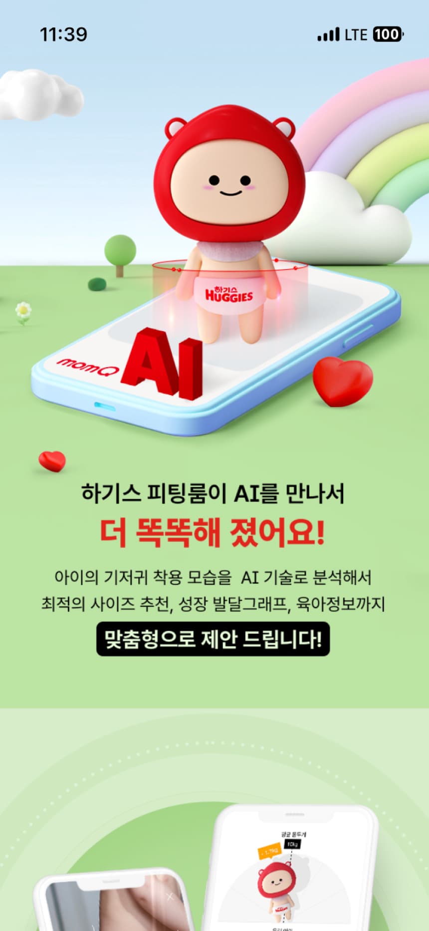
momQ AI Fit
Even baby diapers are in the age of artificial intelligence. Yuhan-Kimberly MomQ launches ‘Huggies AI Fitting Room’ service.
Design
App, UI/UX Design, Visual Design, Motion Graphic Design
Brand Indentity, Character Design, Character Goods
Tool : XD, After Effect, Cinema 4D, Octane, Photoshop, Illustrator
Publishing & Front End
HTML, SCSS, Jquery/Javascript, Hybrid Markup
Tool & Spec : VSCODE, Node, Gulp, Git
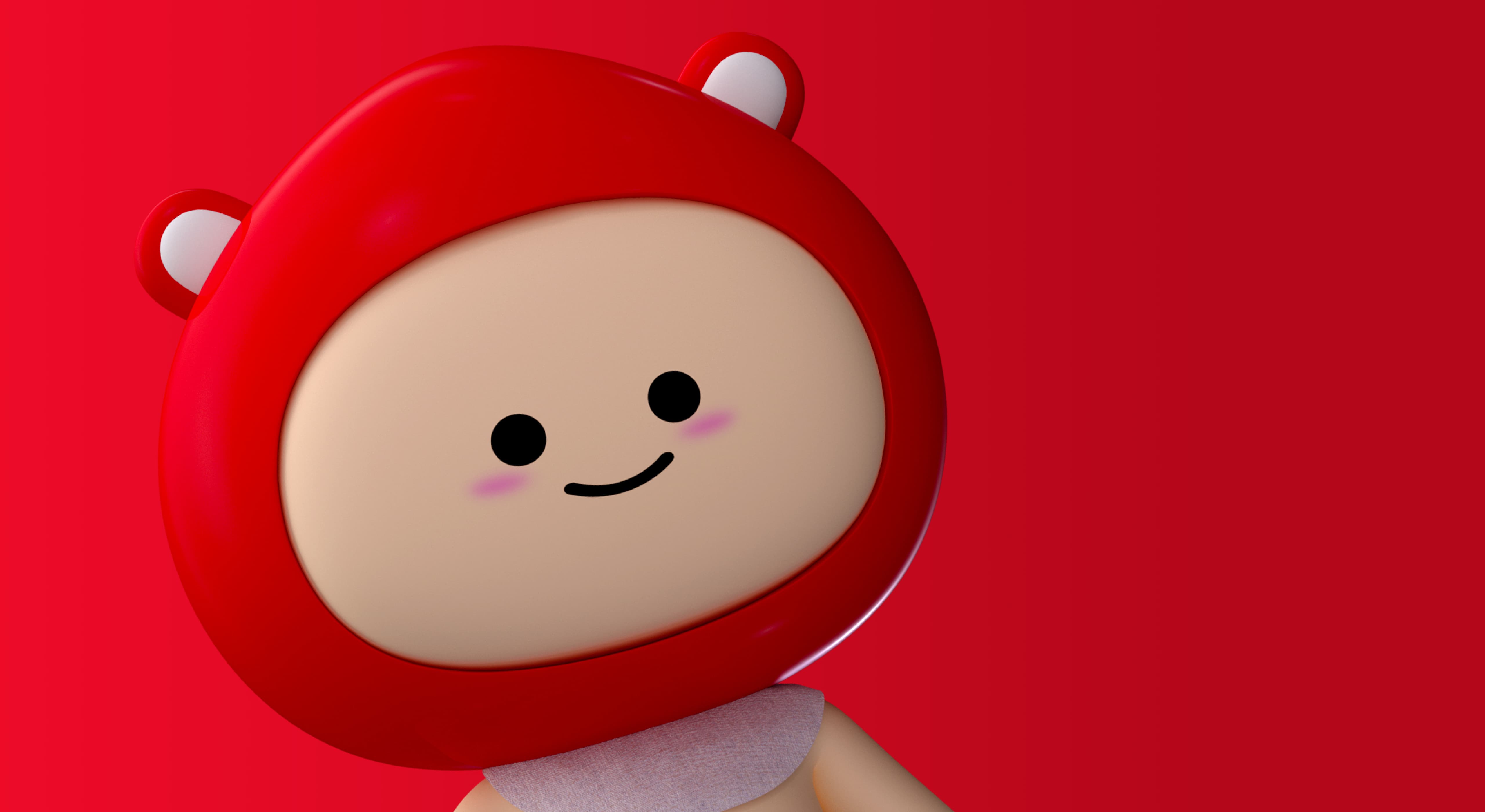
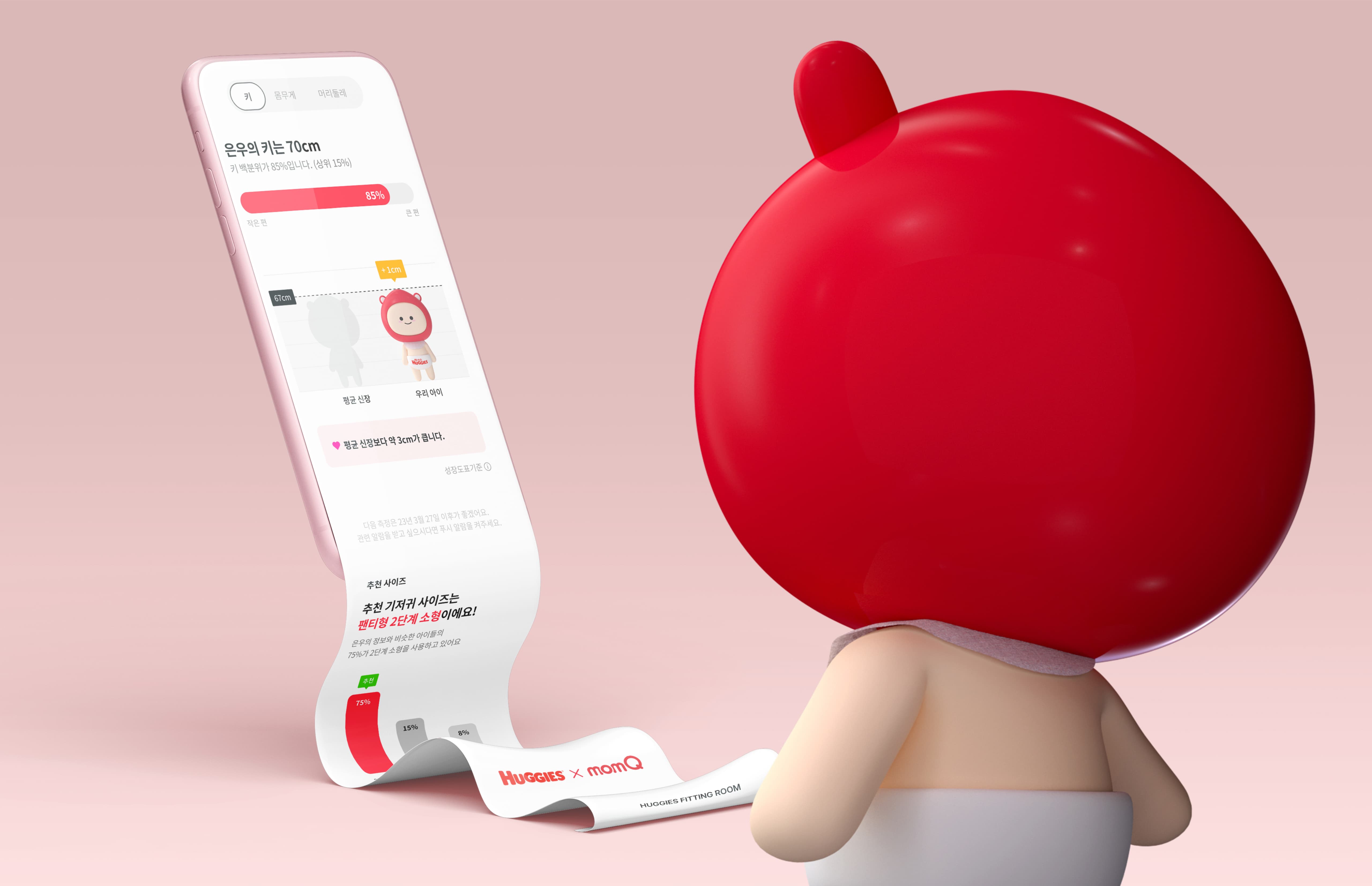
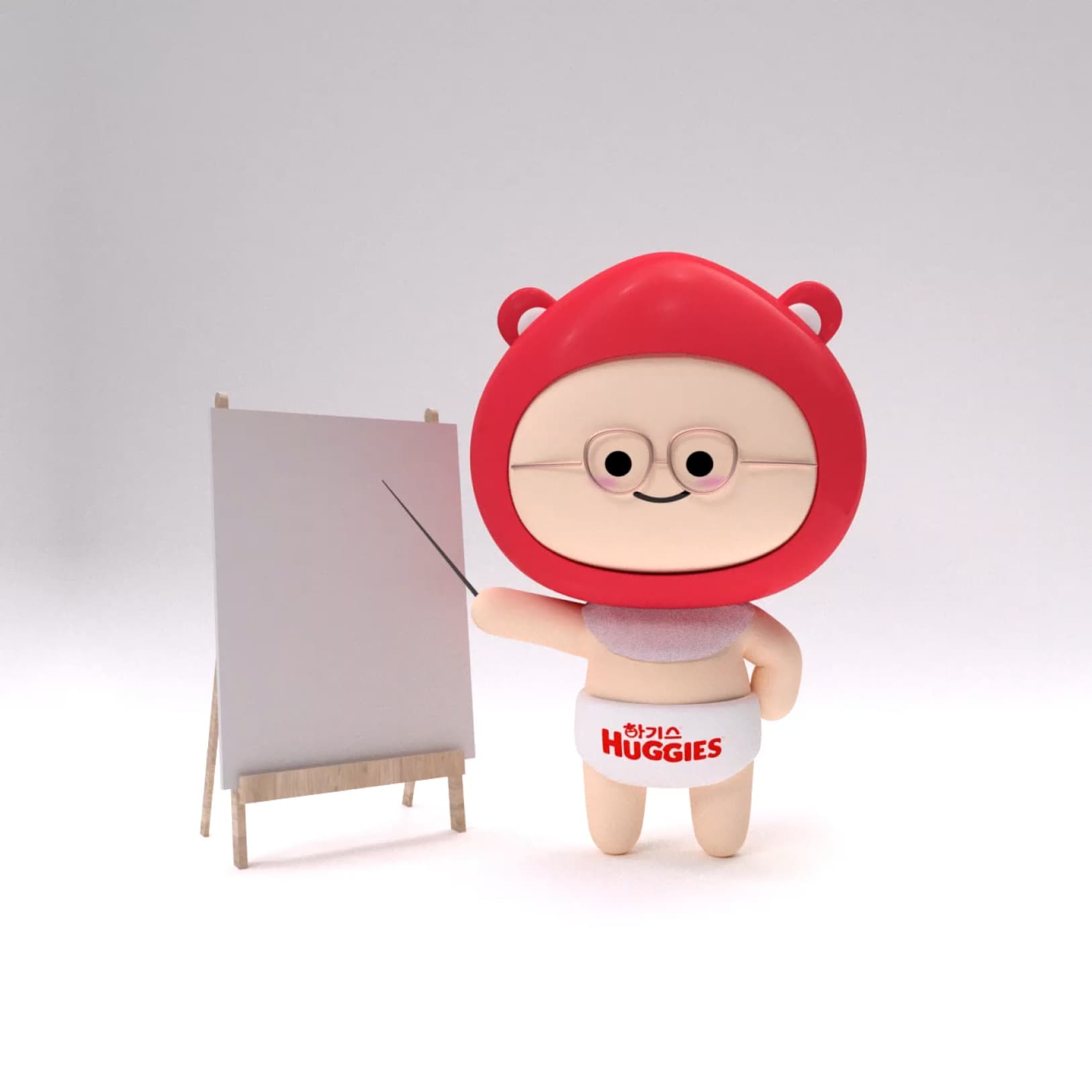
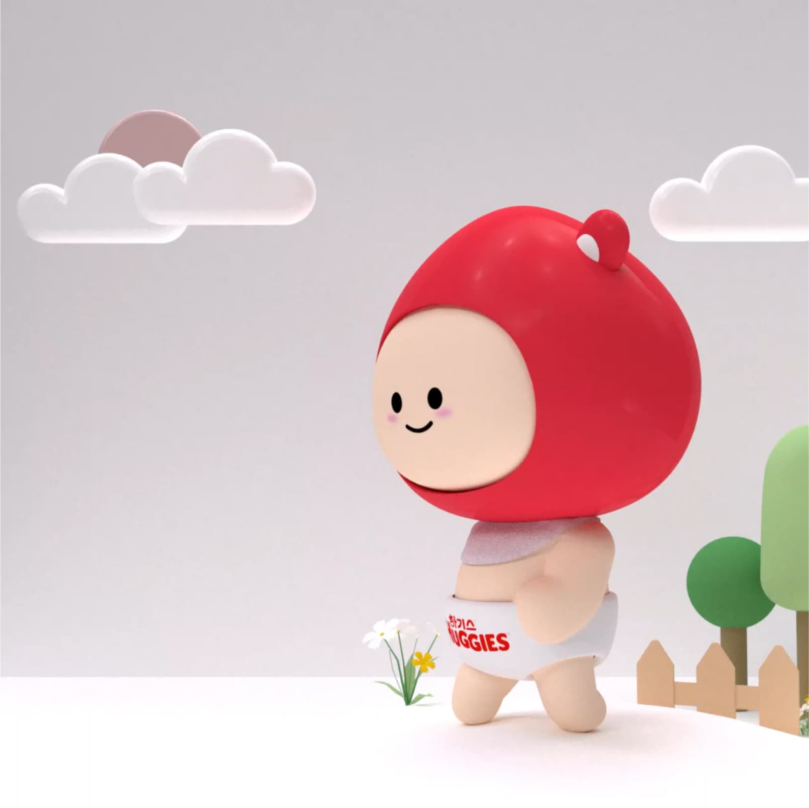
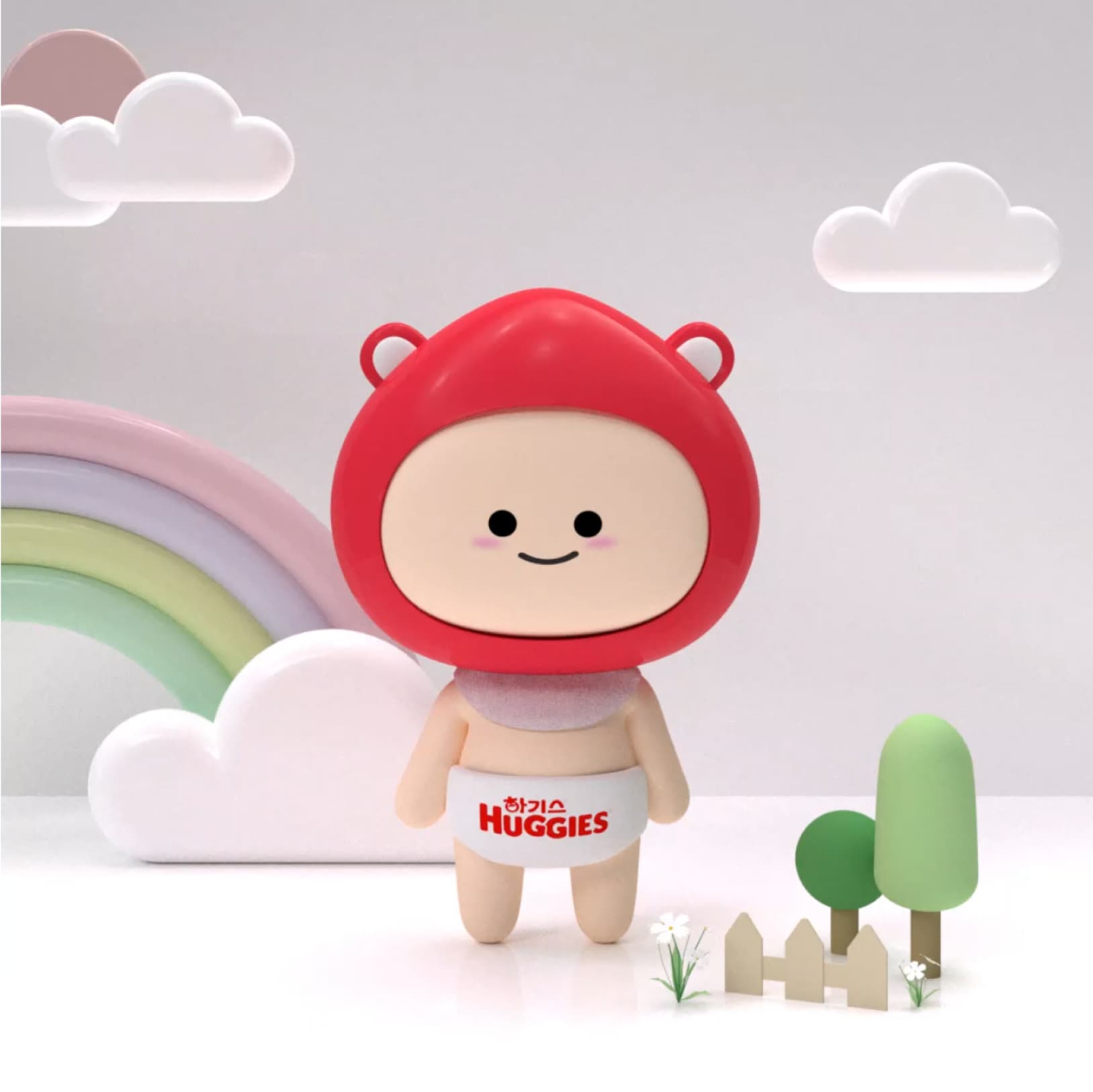
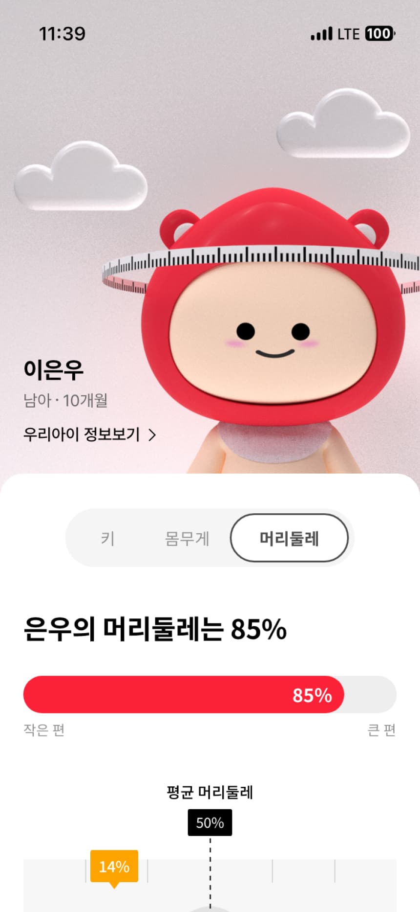
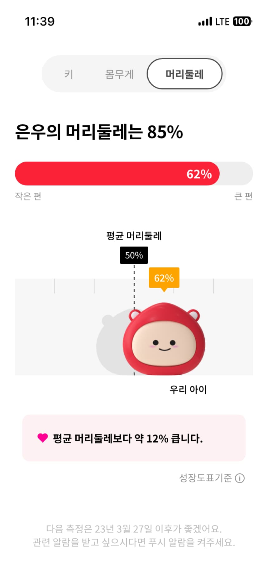
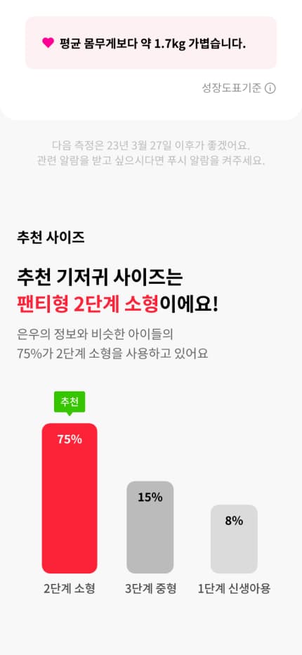
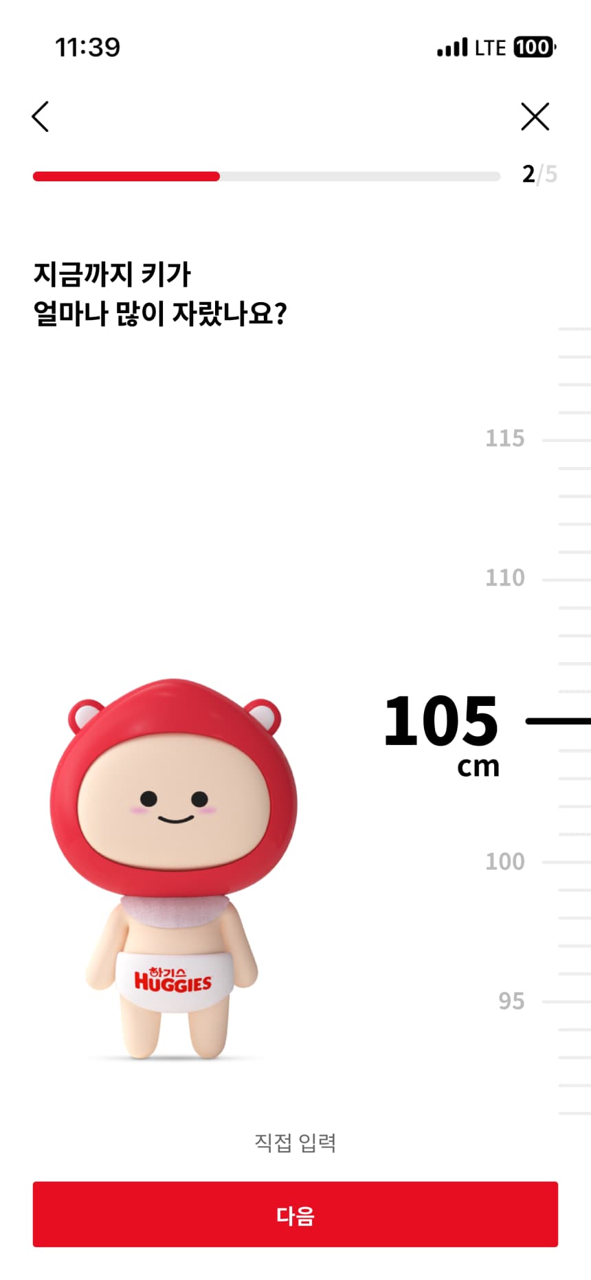
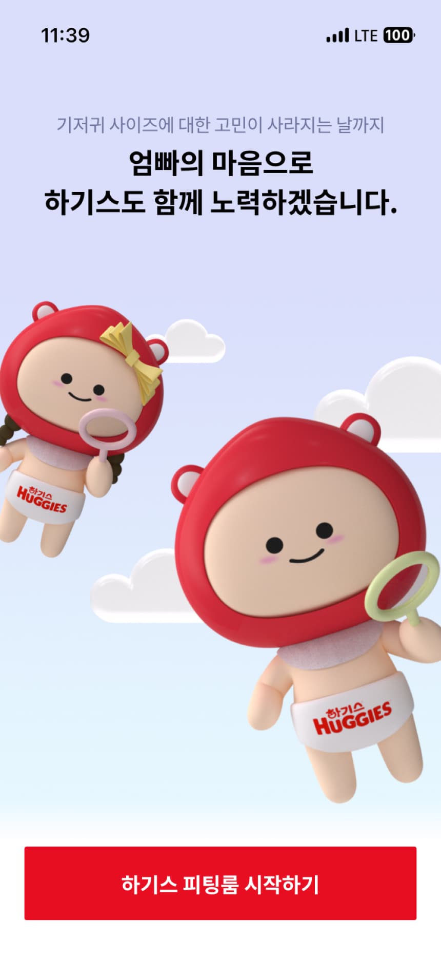
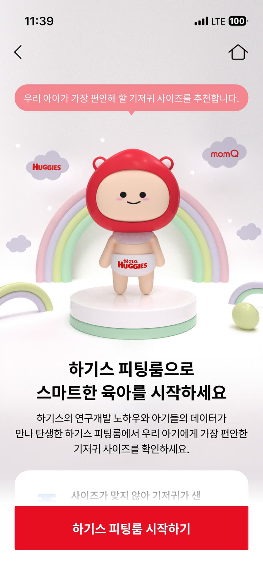
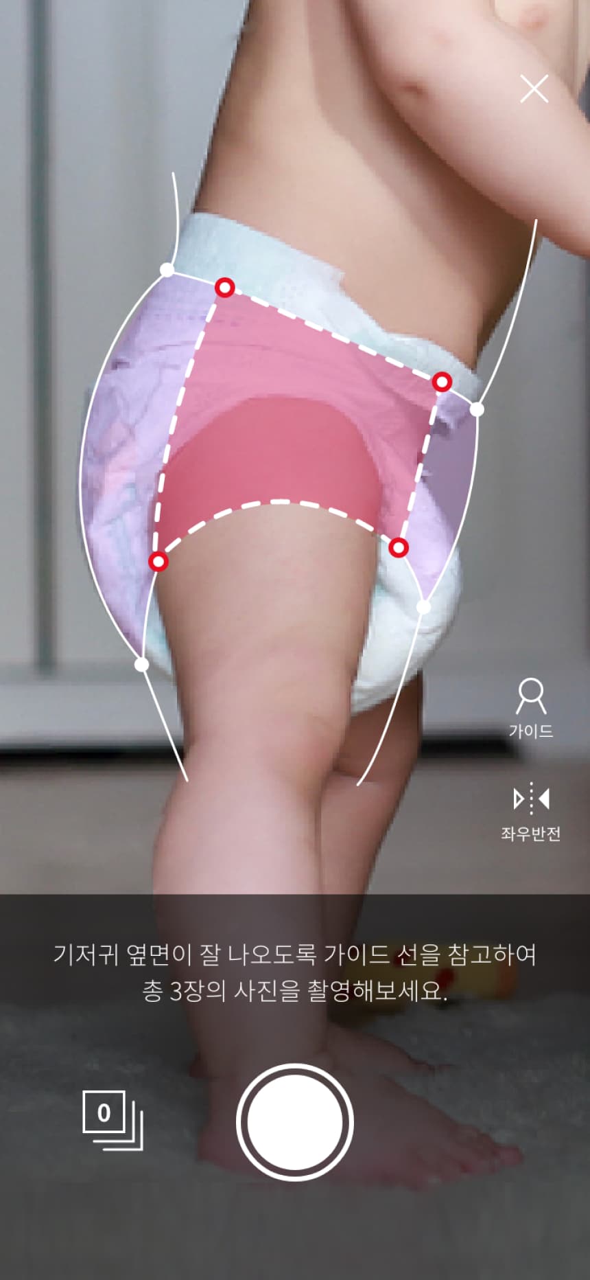
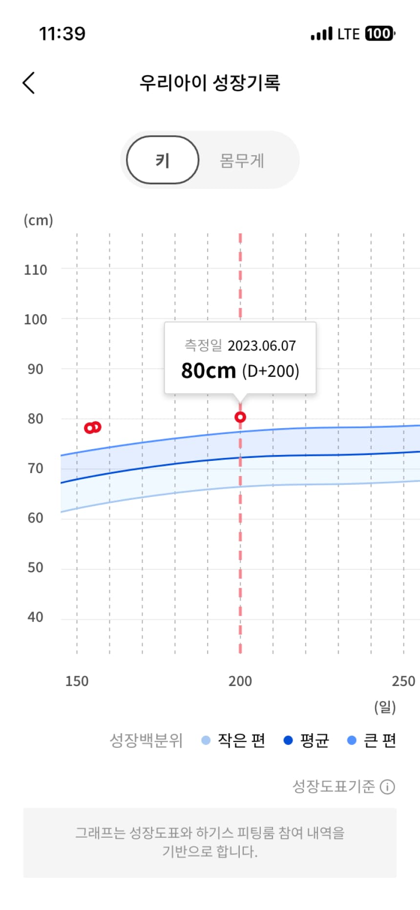
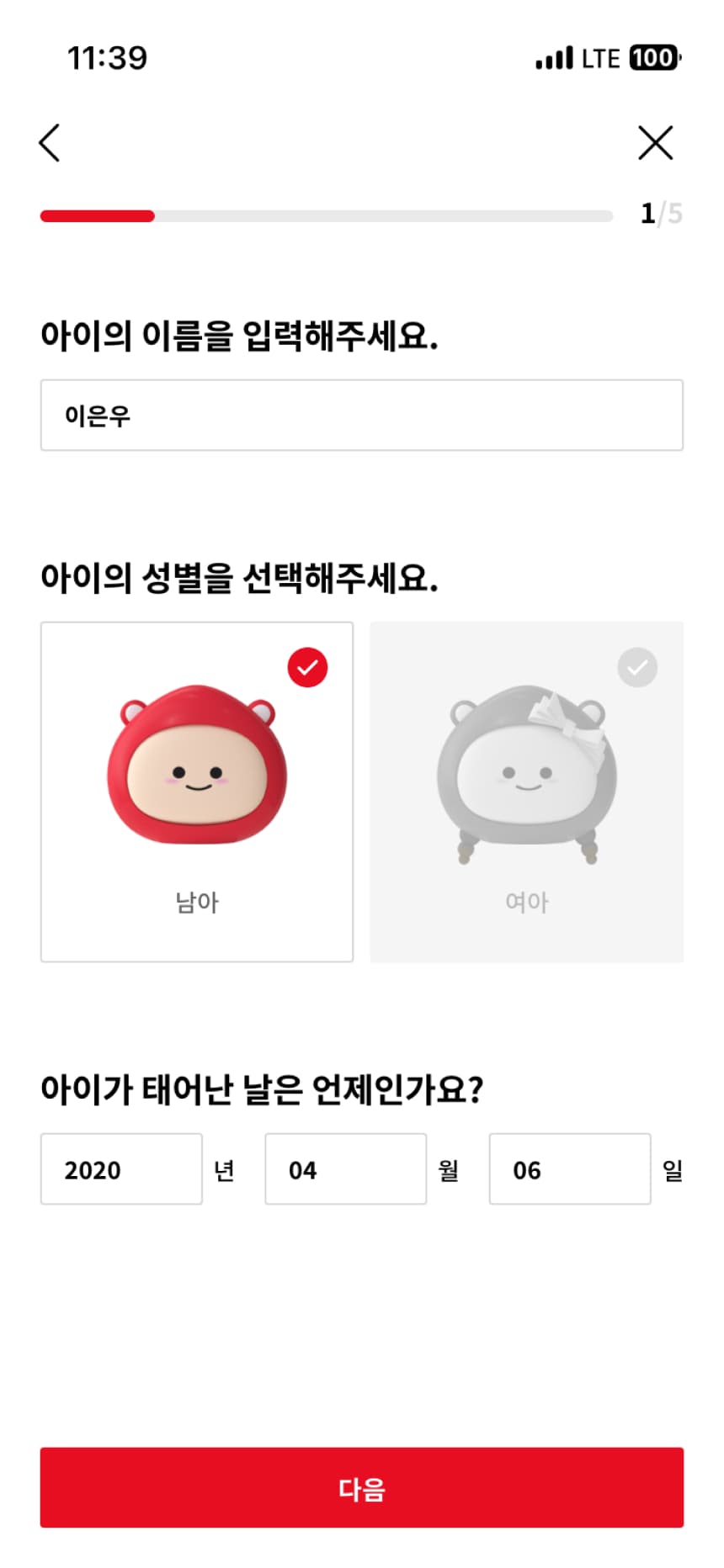
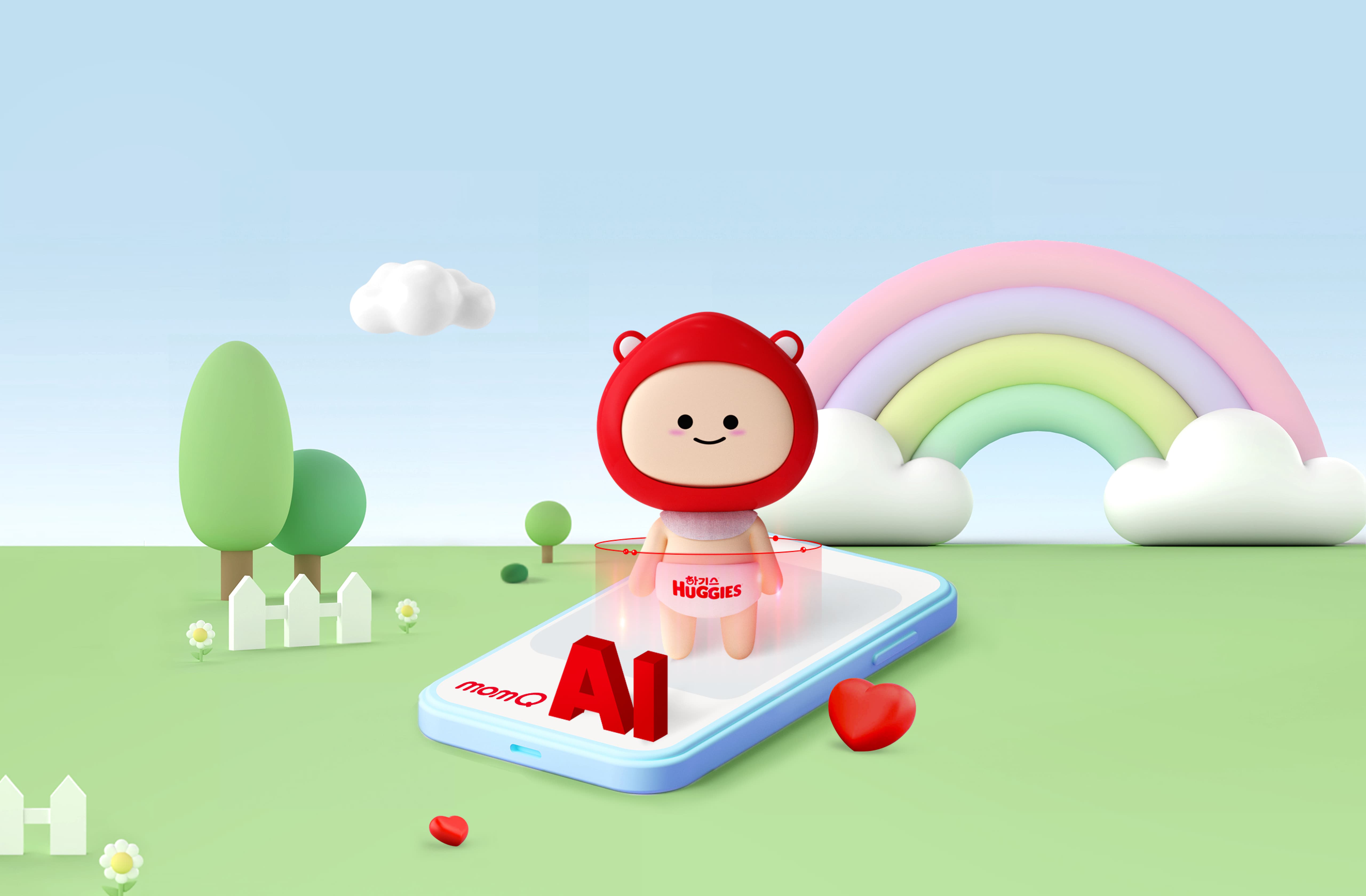
Yuhan-Kimberly Huggies has launched an innovative customer service using artificial intelligence. ‘Huggies AI Fitting Room’ is a service that uses artificial intelligence to analyze and suggest the diaper size that perfectly suits your child, and is provided through the MomQ app. We created an upgraded service by applying the Haggie Bear character, a new brand strategy created by O&A. The process from entering basic information such as the child's height and weight to taking a picture of the child wearing a diaper is provided in an intuitive UI so that users can have an easier and more natural connected experience, and the Haggie Bear character is actively used. It embodies the bright and joyful feeling unique to Huggies Fitting Room.
유한킴벌리 하기스가 인공지능을 활용한 혁신적인 고객 서비스를 출시했습니다. ‘하기스 AI 피팅룸’은 아이에게 꼭 맞는 기저귀 사이즈를 인공지능이 분석하여 제시해주는 서비스로 맘큐 앱을 통해 제공됩니다. 오앤에이에서 제작한 새로운 브랜드 전략, 하기베어 캐릭터를 적용하여 한층 업그레이드 된 서비스를 제작하였습니다. 아이 키, 몸무게 등 기본 정보를 입력하고 아이가 기저귀를 입은 모습을 사진으로 촬영하기까지의 절차를 사용자가 보다 쉽고 자연스럽게 연결된 경험을 할 수 있도록 직관적인 UI로 제공하고, 하기베어 캐릭터를 적극 사용하여 하기스 피팅룸만의 밝고 즐거운 느낌을 녹였습니다.
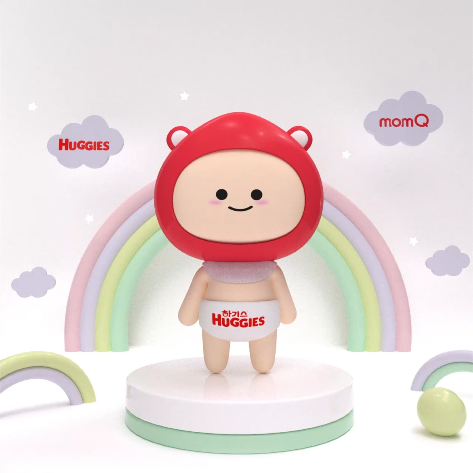
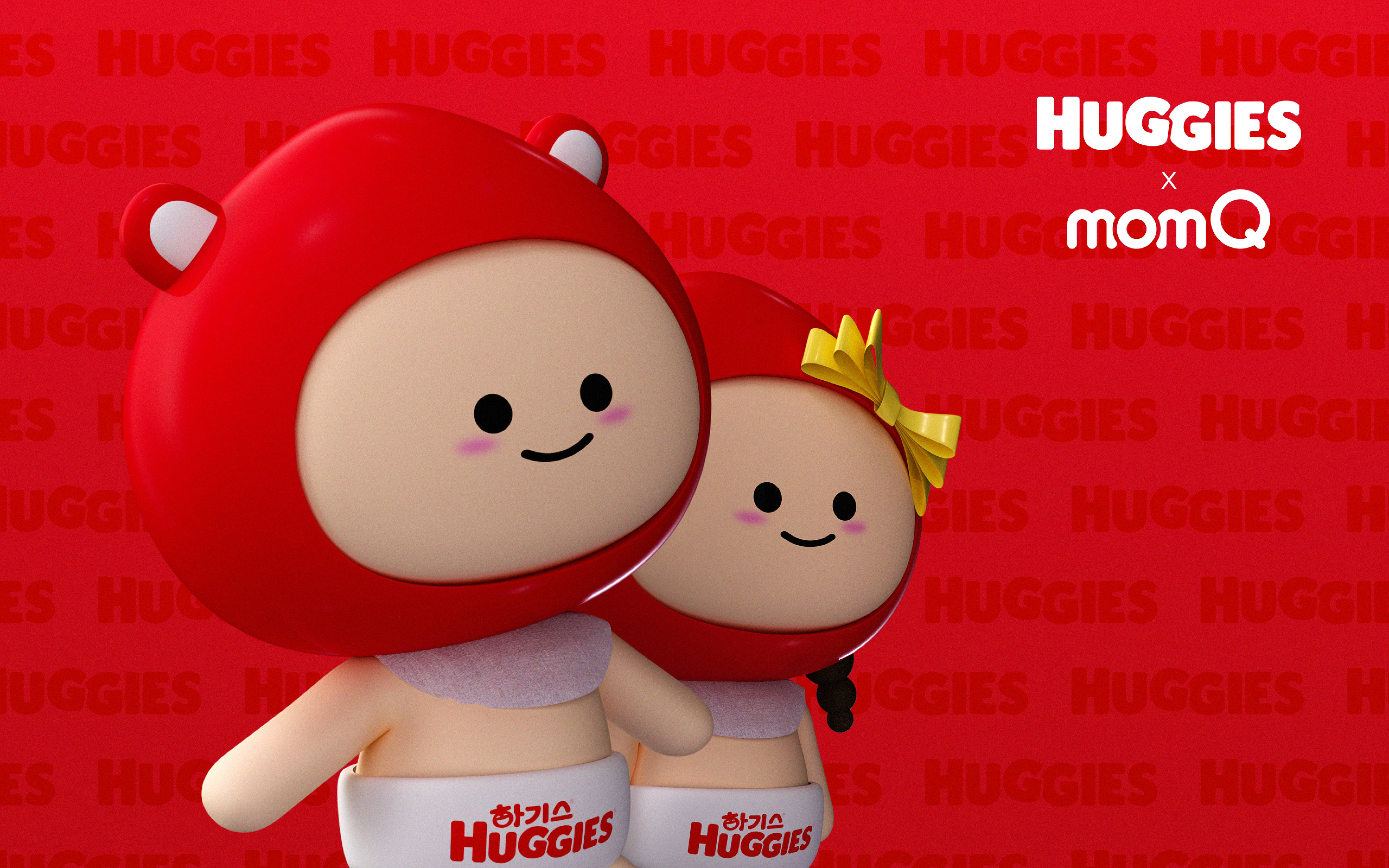
2 characters
소개합니다! 하기스 피팅룸을 더욱 생생하고 재밌게 경험하길 바라며 탄생한 작고 소중한 하기베어들 입니다. 사용자와의 교감을 위해 하기스X맘큐만의 캐릭터를 제작하여 친근하고 귀여운 인상을 전달하였습니다.
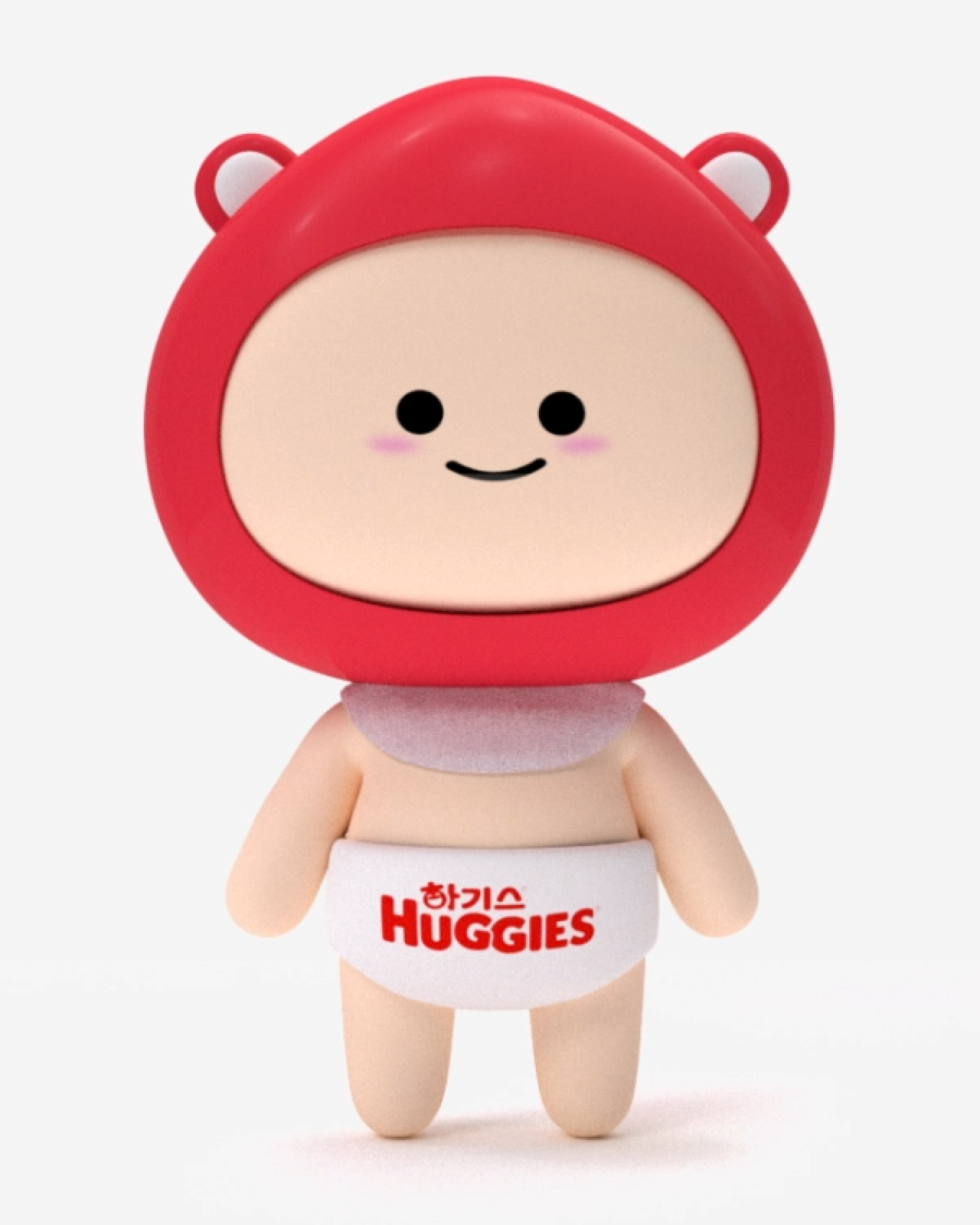
Huggie Boy
&
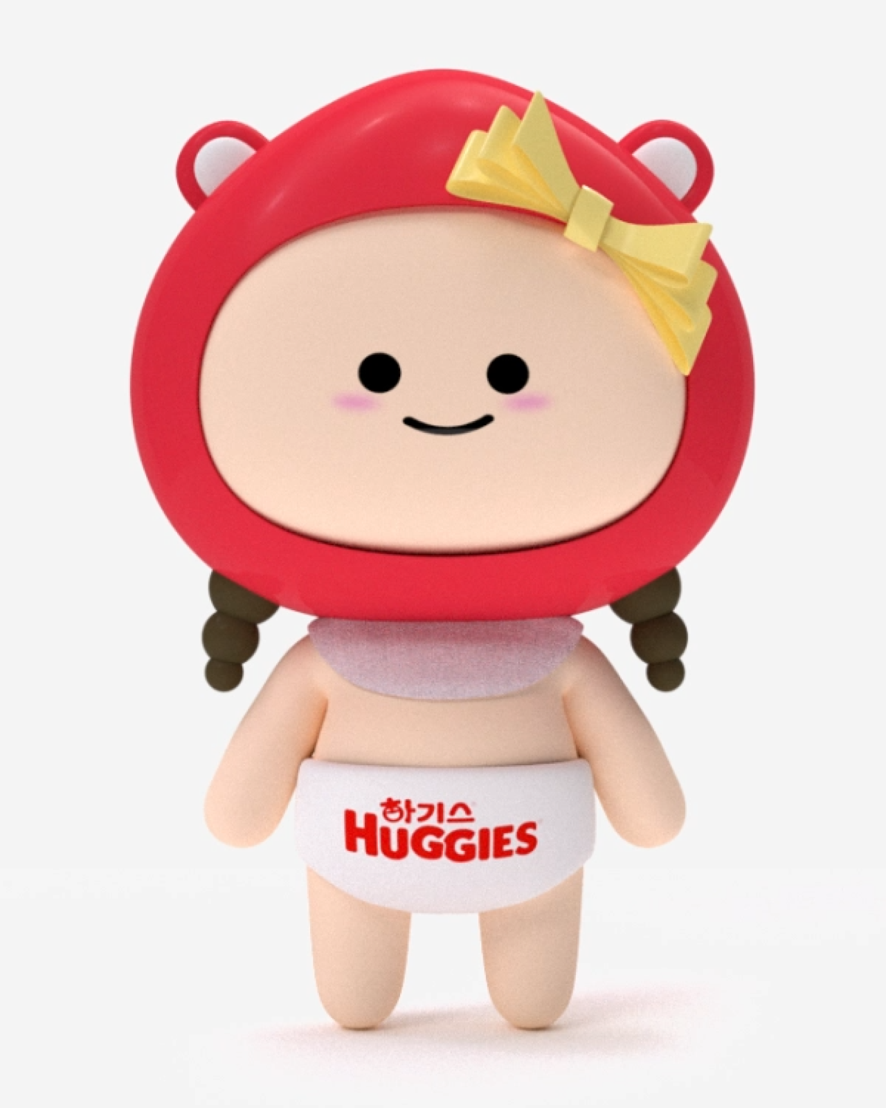
Huggie Girl
Various Poses
아이의 머리둘레, 몸무게, 분석하기 등 다양한 카테고리를 캐릭터로 표현하고, 캐릭터에 생명을 불어넣어 애니메이션화했습니다.
Analyzing
Round and round
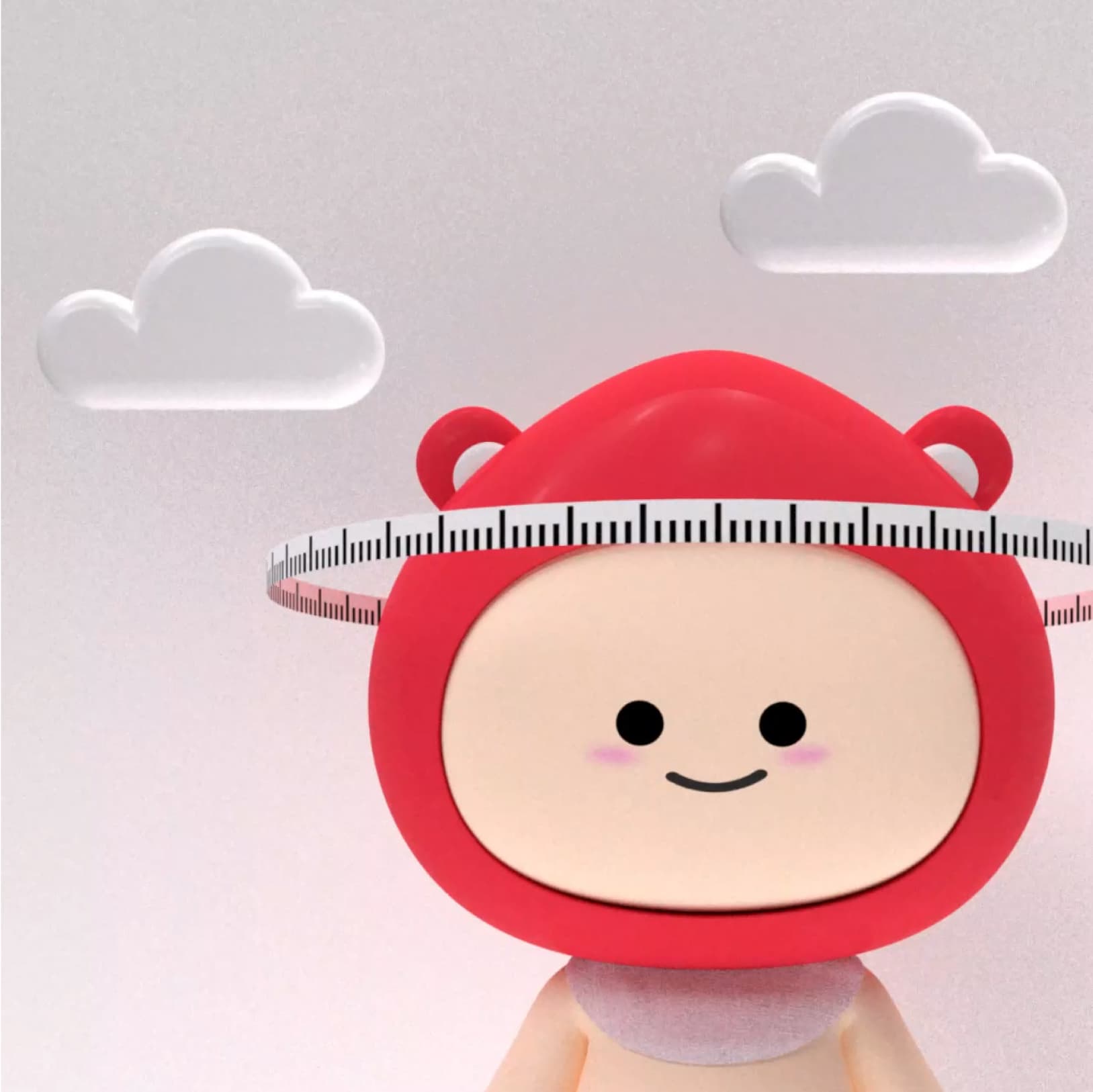
head circumference
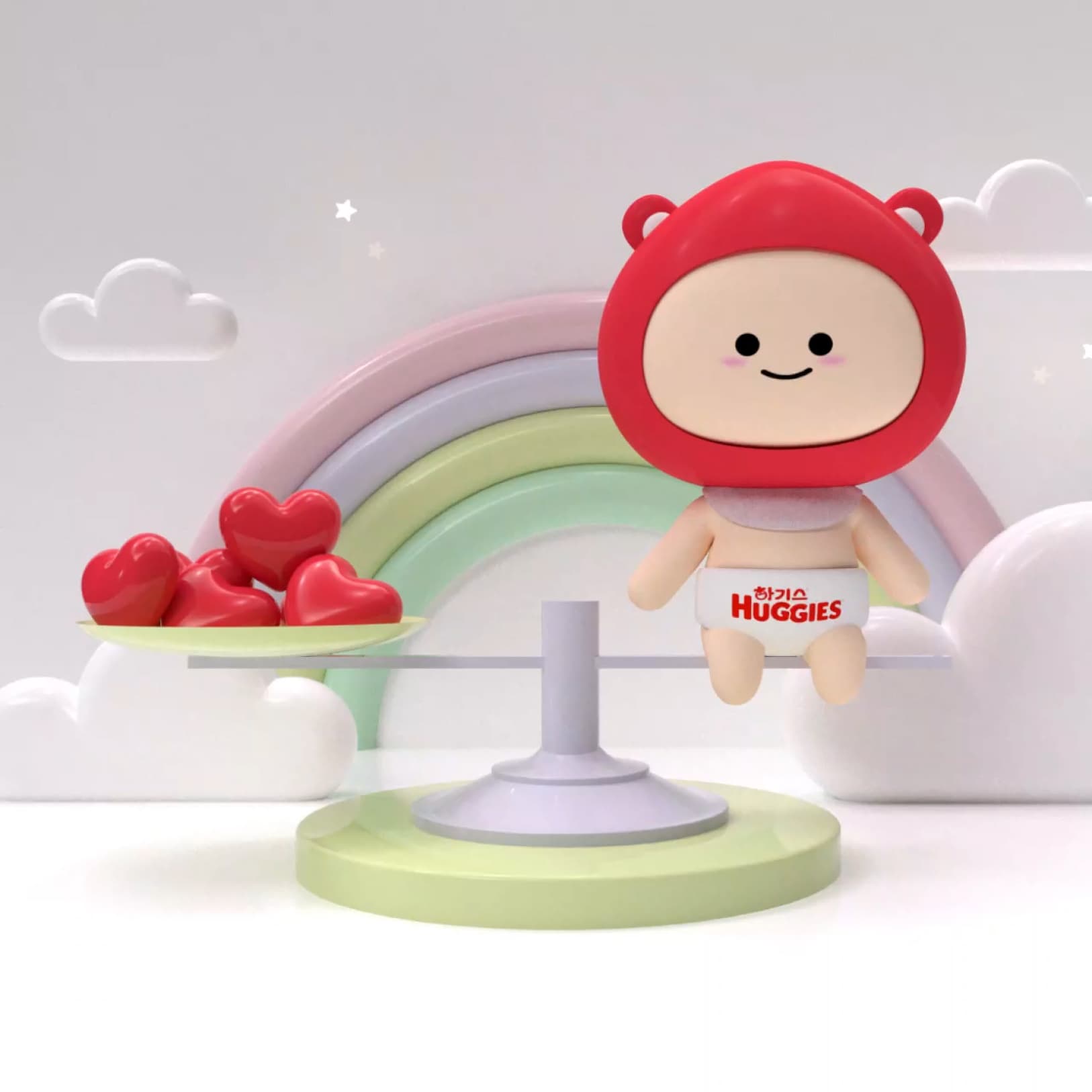
Seesaw
Walking
Tick, crack, crack
Friendly UI
사용자로 하여금 쉽고 재밌게 우리아이의 기저귀 사이즈를 추천받을 수 있도록 하기베어 캐릭터와 명확한 그래픽 UI를 통해 자칫 지루할 수 있는 절차를 간략하고 재치있게 표현했습니다.
Typhography
Noto Sans KR
스마트한 육아의 시작 - 하기스 피팅룸
Bold, SemiBold, Regular
Color
Primary
Primary 100%
Primary 50%
Primary 6%
Secondary
Basic Black
Sub
Disclaimer & Disable
Stroke
Surface
Basic White
Color is a design element that can effectively express a brand image. By excluding other incidental colors and only using red, Mom Q's identity color, as a point, it conveys the bright and vibrant look of MomQ.
컬러는 브랜드 이미지를 효과적으로 표현할 수 있는 디자인 요소입니다.
맘큐의 아이덴티티 컬러인 레드만을 포인트로 사용하여 밝고 생동감 넘치는 '맘큐다움'을 전달합니다.