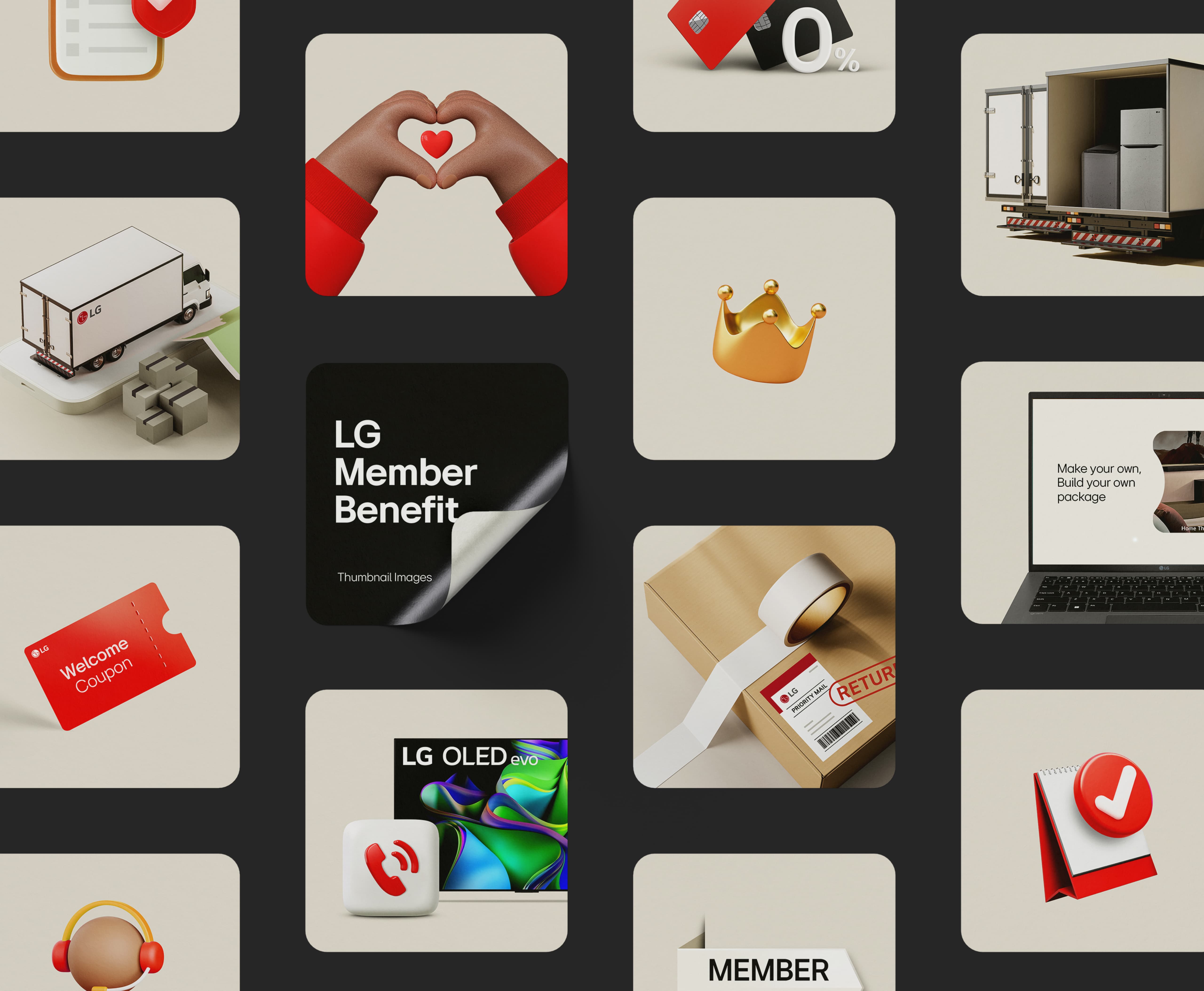
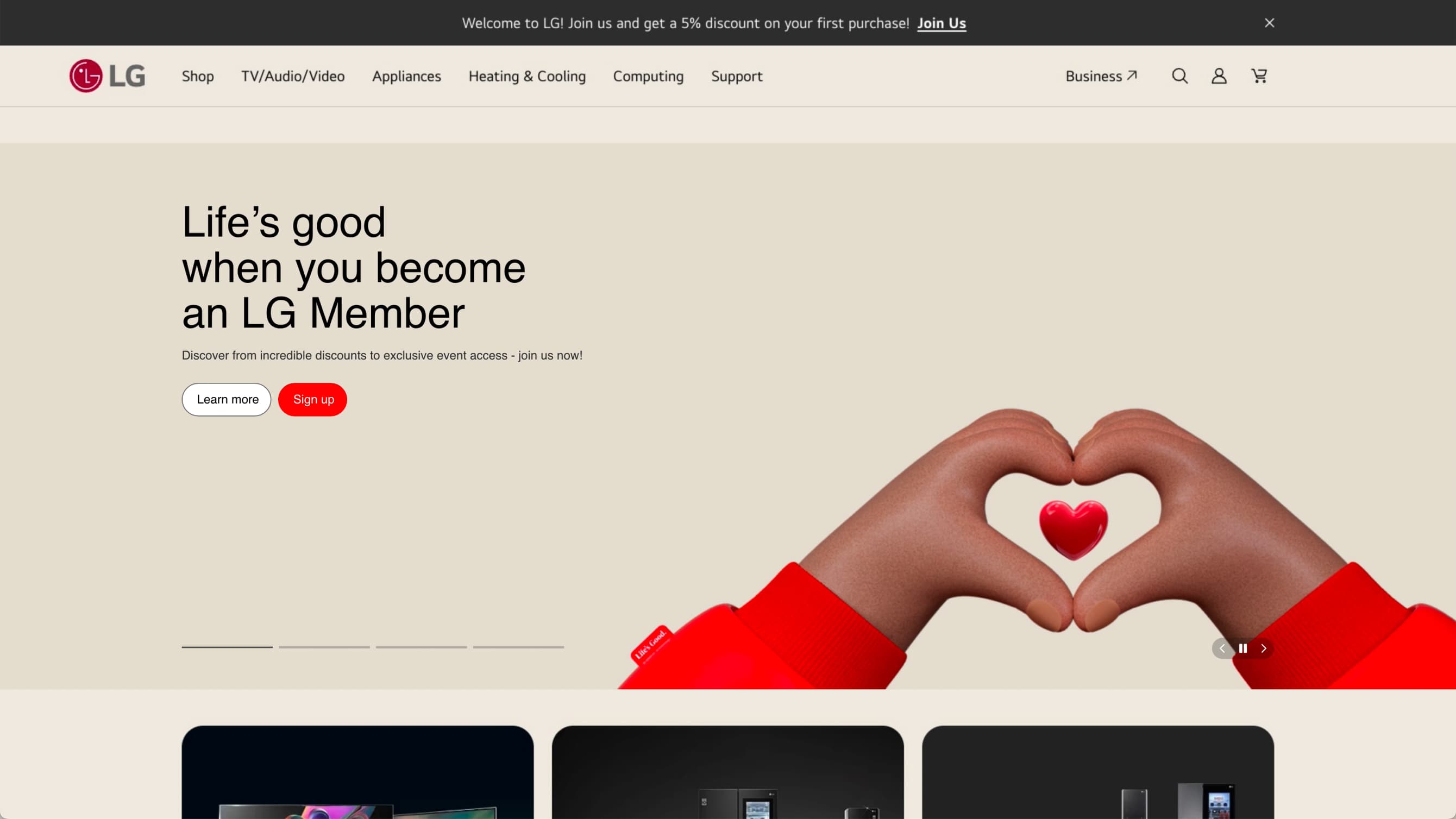
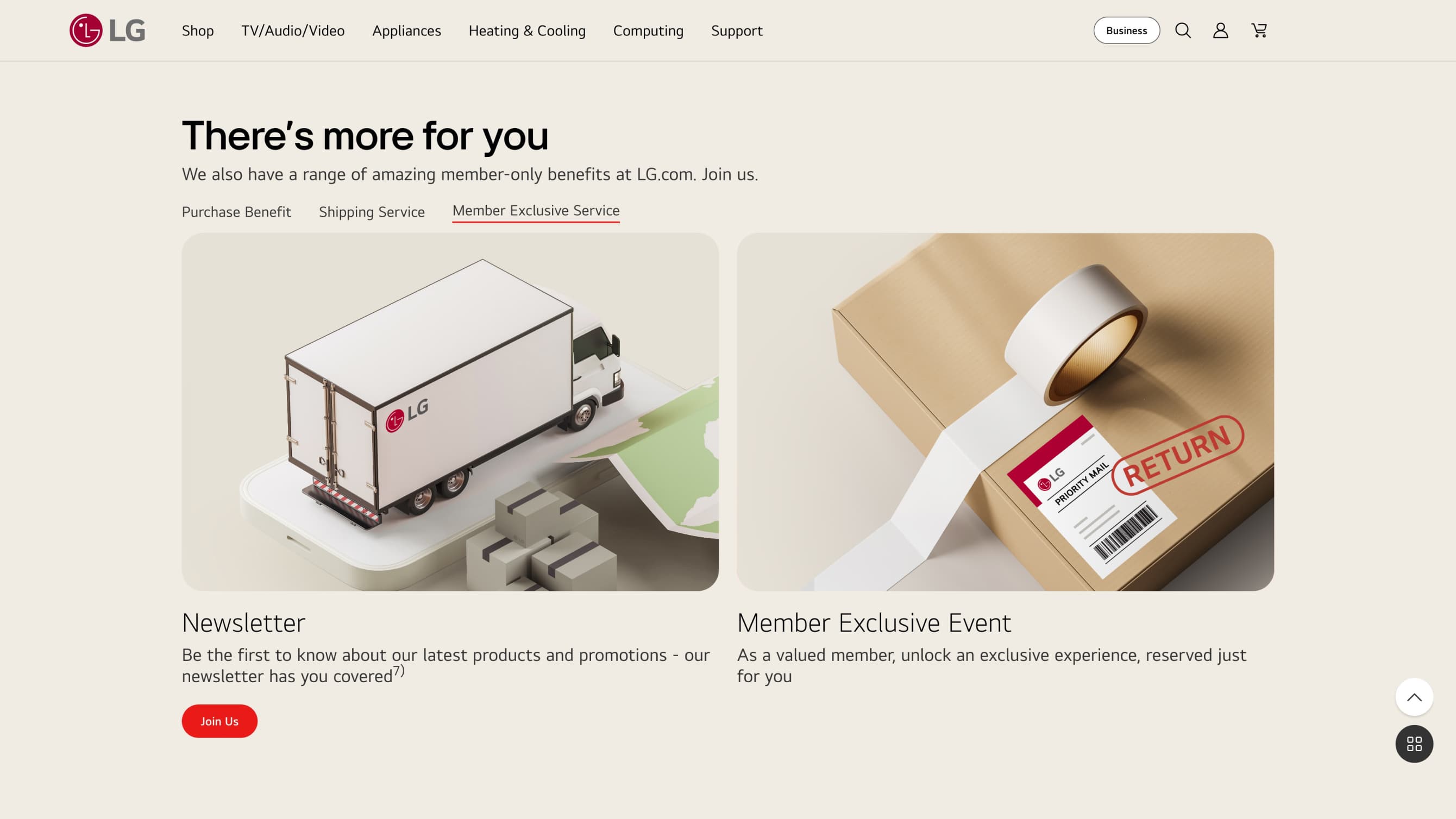
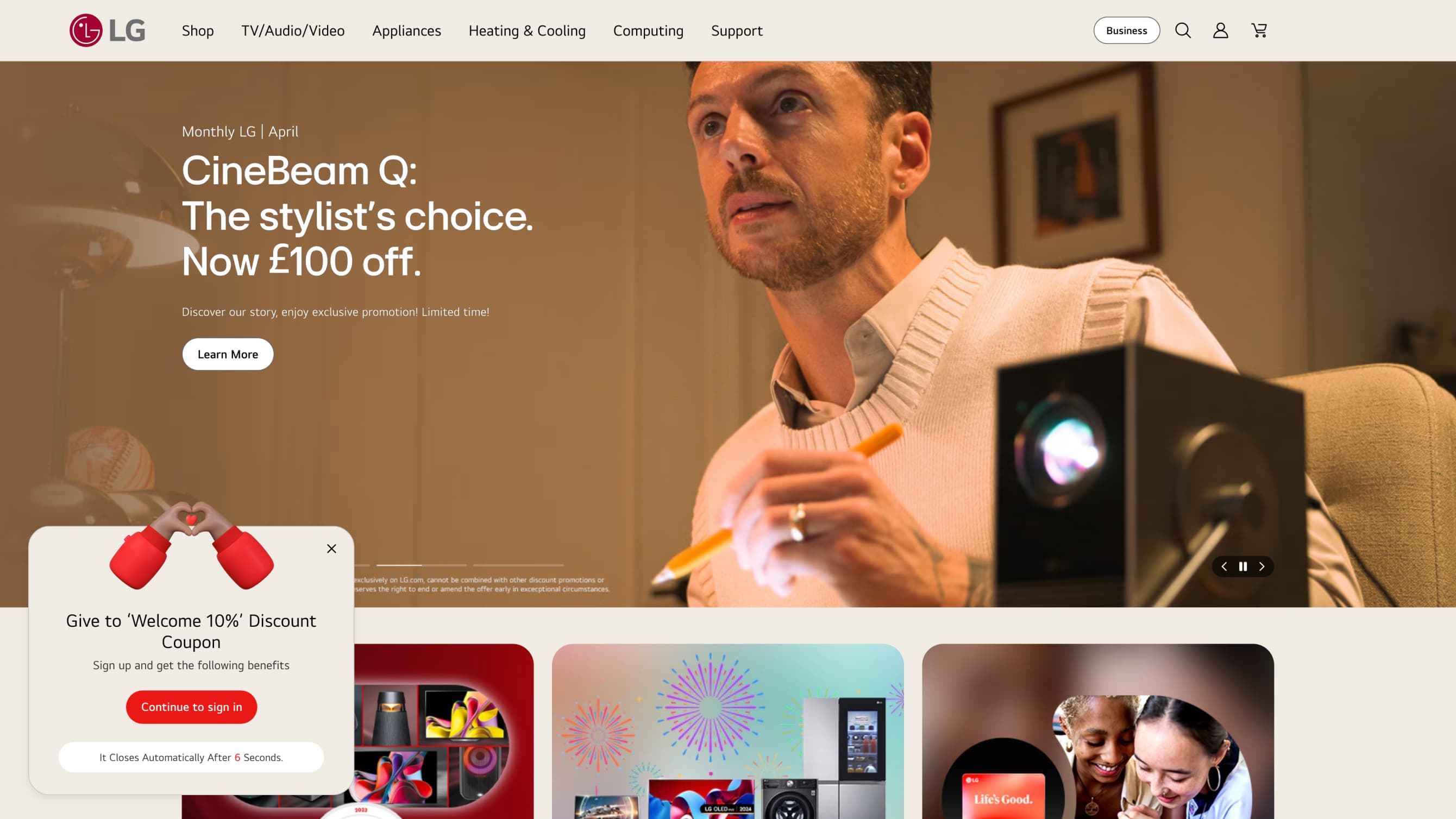
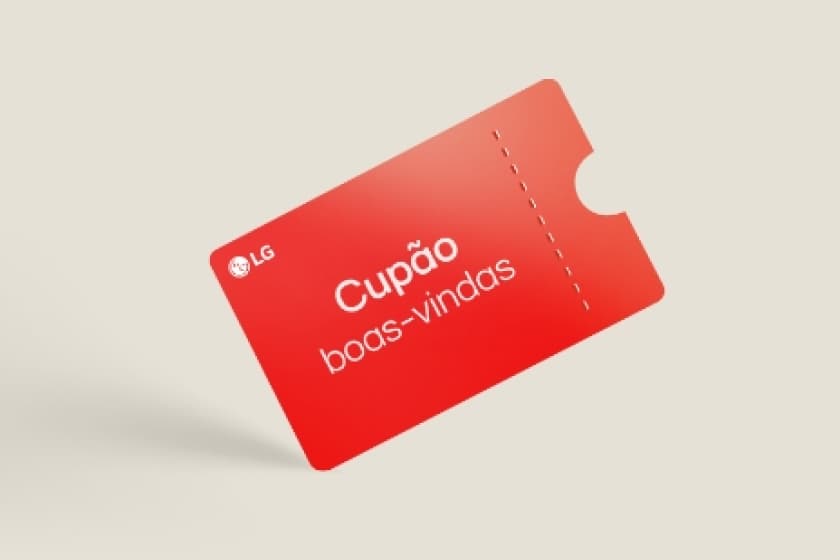
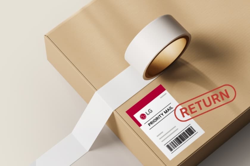
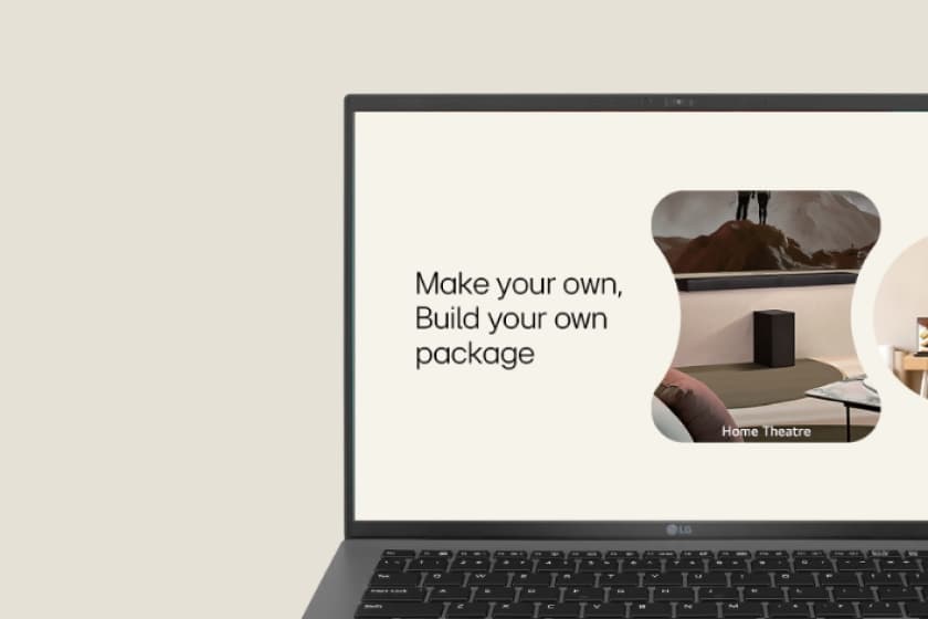
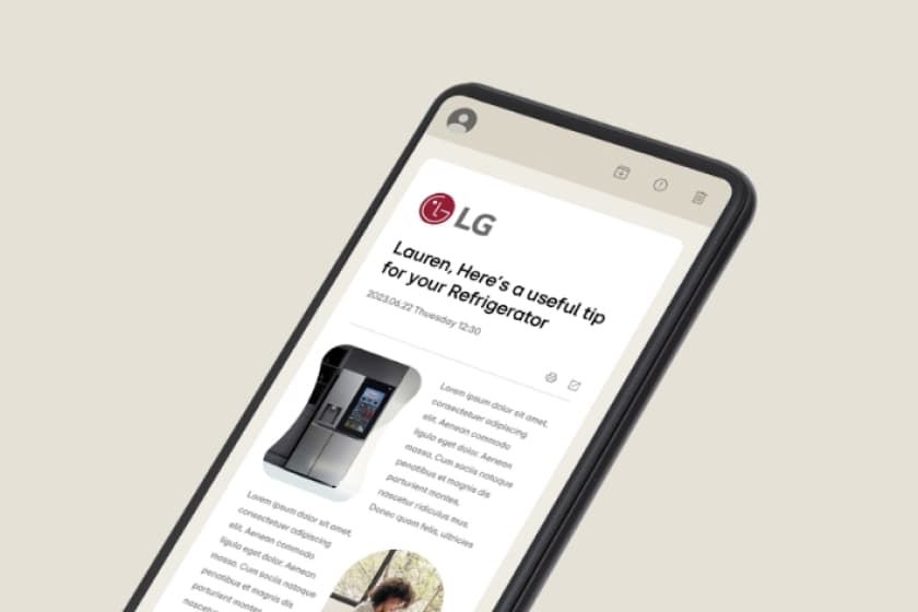
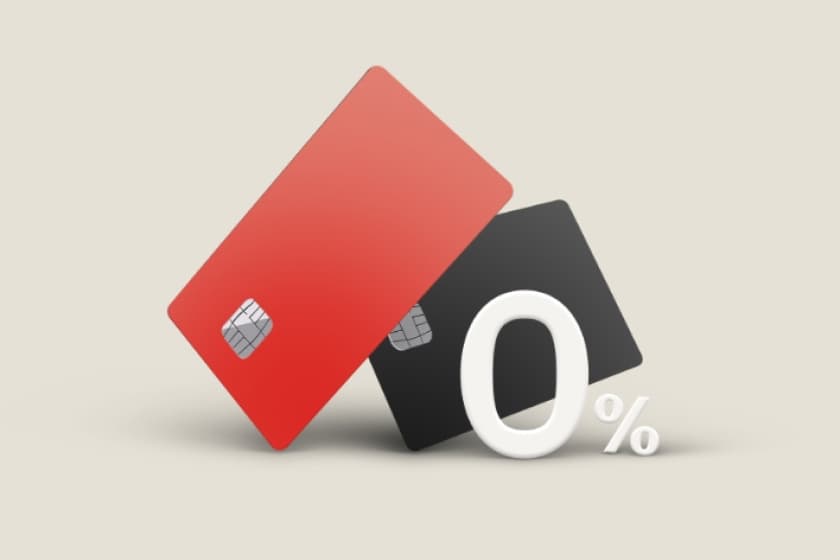
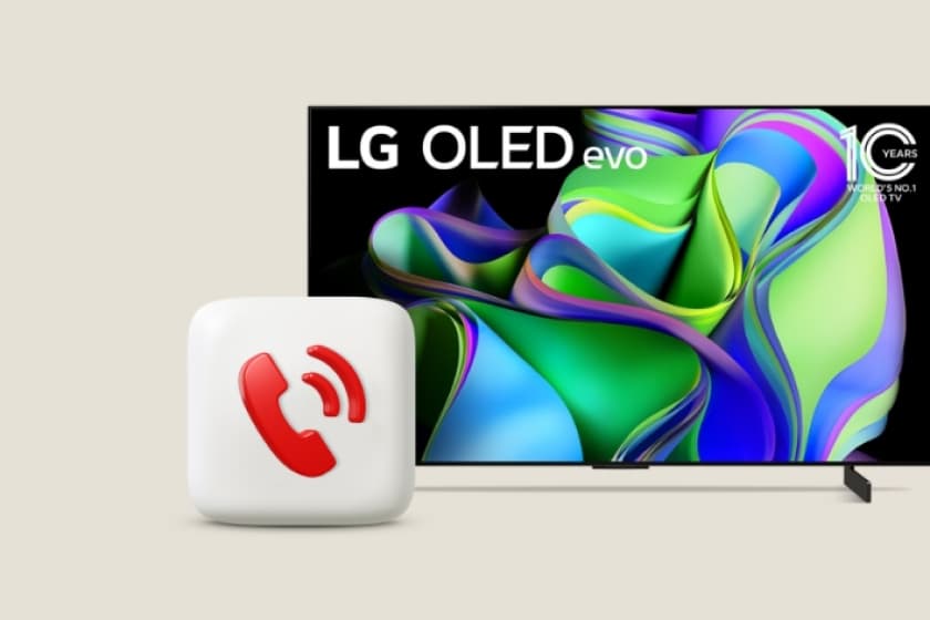
LG Electronics has begun new changes to communicate more closely with customers. In line with the younger and more energetic visual identity of LG Electronics, we have created a page that introduces special benefits available only to LG members. The biggest concern was intuitive visual representation so that customers could understand the benefits at a glance. We tested various styling, including simple icons, real-time photos, and illustrations, and adopted a rendering style that matched the new LG Electronics brand communication guide to establish an integrated brand orientation. Membership benefits vary by country, but through consistent brand communication, everyone around the world experiences the same image and message, contributing to improved brand value.
LG전자가 고객들과 더 가깝게 소통하기 위한 새로운 변화를 시작했습니다. 더 젊어지고 더 활기 넘치는 LG전자의 Visual Identity에 맞추어 LG 회원에게만 주어지는 특별한 혜택을 소개하는 페이지를 제작하였습니다. 고객이 어떤 혜택들이 있는지 한눈에 파악할 수 있도록 직관적인 시각적 표현이 최대 고민이었습니다. 심플한 아이콘, 실사, 일러스트 등 다양한 스타일링을 통한 테스트를 하였고 그중 새로운 LG전자브랜드 커뮤니케이션 가이드와 렌더링 스타일을 채택하여 통합적인 브랜드 지향점을 구축하였습니다.
국가별로 멤버십 혜택은 다르지만, 일관된 브랜드 커뮤니케이션을 통해 전 세계 누구나 같은 이미지와 메시지를 경험하여 브랜드 가치 향상에 기여했습니다.